Article
Building a flexible and easy-to-use design token system
%20(1).webp)
What are design tokens, and why are they beneficial to a product organization?
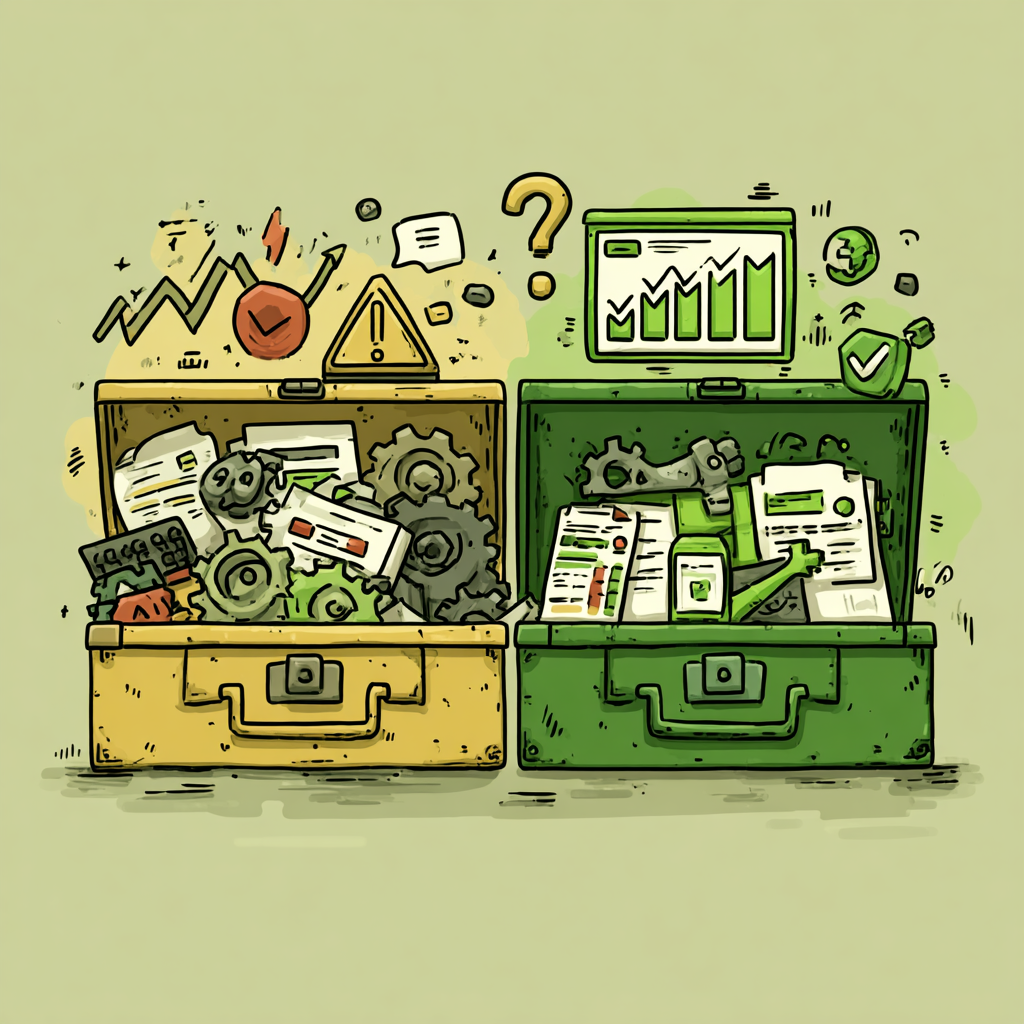
Design tokens are design principles that are represented as data values. They define and represent design elements such as color, typography, spacing, and other visual and functional design attributes in a way that can be consistently applied and maintained across a product or brand. They are a powerful tool for product organizations that help maintain consistency and cohesiveness throughout their products. These values are defined once and can be reused across the entire product, making applying changes to your design system easy. This approach allows teams to focus on the bigger picture, creating a more efficient and effective workflow.

Why did we need them at Ondorse?
At Ondorse, we understand the benefits of centralizing values and reducing daily micro-decisions that slow down product delivery and add technical debt.
One decision that has helped our team a lot was relying on a CSS framework with pre-defined components. We opted for Chakra UI. Frameworks like these are extremely helpful in allowing teams to focus more on UX and information architecture rather than UI development itself.
Chakra UI has not only a bunch of pre-defined components, but also a whole bunch of tokens, like spacings, typography, color shades, shadows, radii, and motion curves. Pretty much everything you need to make your UI look great!

What currently satisfies the requirements for our UI kit?
Our objective was not to build a design system on day one. Instead, we plan to develop Ondorse's design system iteratively. Chakra was a great starting point, providing a qualitative and comprehensive foundation to build upon.
However, using a CSS framework can also have downsides. All interfaces may look like templates, with standardized components and a neutral color palette. Customization is required to achieve interfaces that accurately reflect your brand identity.
So, we started by getting into the nitty-gritty of fonts and colors. We swapped out the default fonts with our own ones and came up with a fresh new color scheme inspired by our Ondorse vibes. Our palette contains consistent shades of color, all with the same amount of contrast for each shade. There are tons of awesome tools out there to help you pick out consistent and accessible palettes. For our situation, we went with the super helpful Accessible Palette.
Multi-layered tokens or token tiers
We wanted our color token set to be flexible, in a way that we could easily come back to a decision and change the color of our primary buttons, or the color of the inputs stroke in a second. The best solution we found to tackle this challenge was to introduce several layers of tokens.
The first layer consists of raw values such as blue-50, blue-100, and blue-200, along with their associated HEX codes. We refer to these as 'option tokens'.
The second layer is named according to how these values are used, such as color-button-background. We based this token model on Lukas Opperman's insightful article, Building better products with a design token pipeline. We refer to these as 'decision tokens'.
We really enjoyed this model because it guides the design process through usage-oriented naming, and provides flexibility through option tokens and decision tokens. For example, if you need to rebrand or improve the accessibility of a specific component, you can easily make changes by reassigning the raw value to an option token, or the option token to a decision token.

To maintain a consistent format, we have defined a token semantic structure that covers most cases.
root - type - component - (attribute) - (state)
e.g. —ond-color-secondary-button-border-hover
Figma limitations and how to bypass them?
Figma, the popular design tool, has some limitations when it comes to creating and managing design tokens. However, there are workarounds to this issue. The option we opted for right now is to export our option tokens and decision tokens as a JSON file on a regular basis.
What’s the next challenge?
The next challenge for Ondorse is to continue developing and refining our design system by building more advanced token tiers that allow for even greater flexibility and customization. We also plan to explore other tools and frameworks that can help us streamline our design process and ensure consistency across all of our products. Ultimately, our goal is to create a design system that is both flexible and cohesive, allowing us to build beautiful and functional products that truly reflect the Ondorse brand.
Oh, and by the way, make sure to take a look at this other article from Lukas Opperman for some more tips on how to name your tokens.
Join our team at Ondorse as we continue to refine our design system and build an amazing product! Check out our career page for more information on available opportunities.
Discover our latest guide
Everything you need to know about this subject
Heading
Subtextt

.jpeg)


.avif)